As cities grow, so do carbon emissions. But getting from A to B doesn’t have to harm you or the environment. The Nought.One is change in motion: a zero-emissions ride for sustainable journeys through the urban environment. We partnered with Nought to transform them from a startup with a great product into an industry-defining brand.
Client
OKO
Industry
PLANT TECH
Timeframe
2025-present
services
Brand Strategy
Brand Identity
Packaging Design
UX/UI Design
Shopify Development
Testimonial
" I would like to say how happy I am with the work Opulo have done. From the brand and website to social media and blogs it all looks really smart, portrays the tone of the brand very well. and is delivering results."
Mark Reilly  / founder
OKO is revolutionising plant care with its innovative smart sensors and companion app, designed to eliminate the guesswork and ensure your plants thrive effortlessly. By providing real-time, species-specific insights into essential factors like water levels, temperature, air humidity, and pH, OKO empowers both novice and experienced plant owners to maintain healthy, vibrant plants without the usual challenges.
Project overview

Never kill a plant again

In our partnership with OKO, we aimed to develop a brand identity that embodies harmony and simplicity, reflecting the product’s ability to integrate seamlessly into any interior while allowing the plants to take centre stage. The objective was to create a calming and expert aesthetic that resonates with users seeking effortless plant care solutions.

Building the brand

Organic elegance

To achieve this, we hand-drew the wordmark, intentionally incorporating organic, asymmetrical linework to convey a sense of growth and natural development, rather than mechanical construction. For the standalone icon, we  extracted the section between the ‘K’ and ‘O’ from the wordmark, which was deliberately designed to represent an abstract flower. This subtle yet effective approach ensures that both the wordmark and icon are cohesively linked, creating a magical identity that perfectly aligns with OKO’s brand ethos.

Packaging

effortless online experience

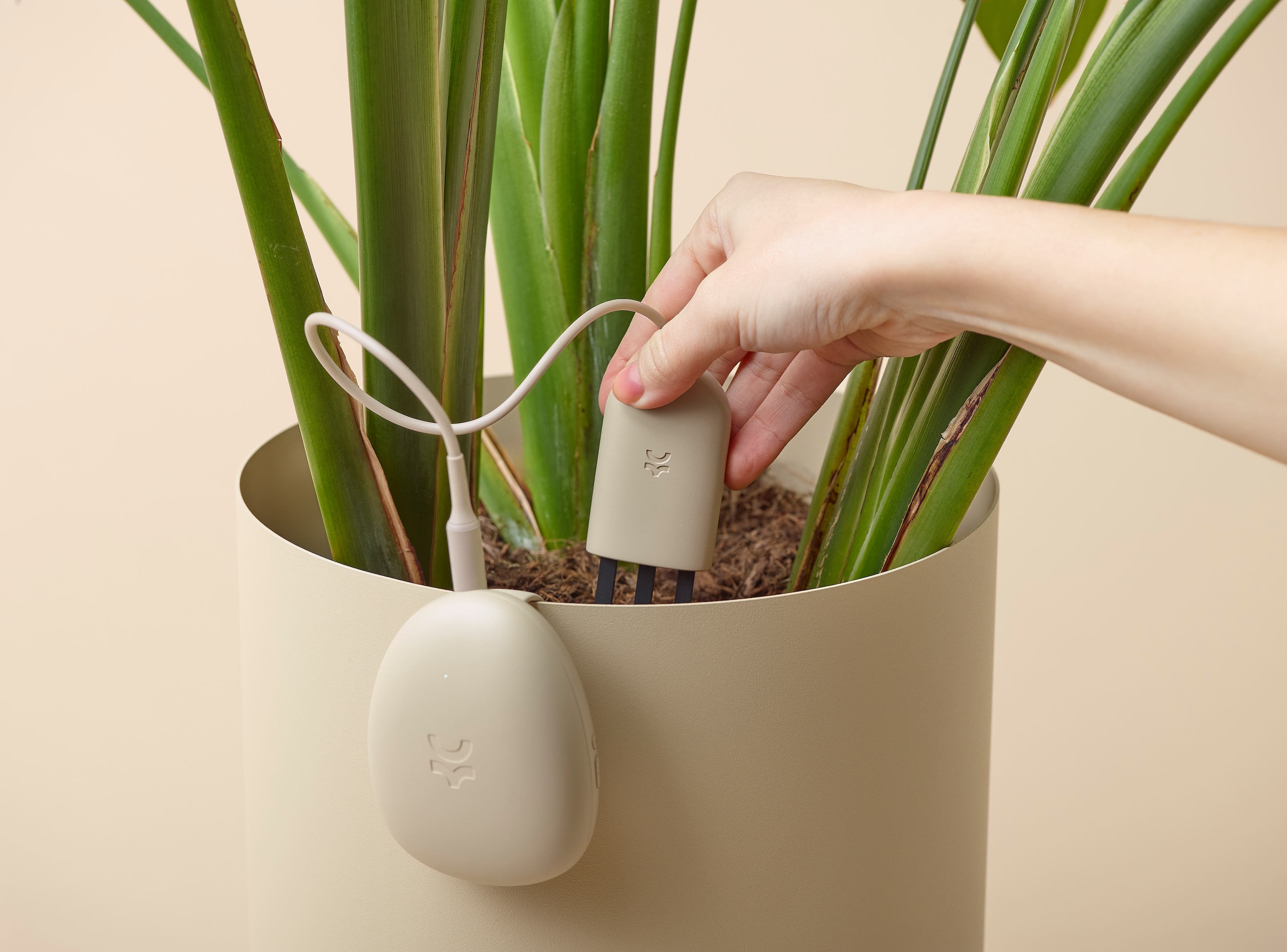
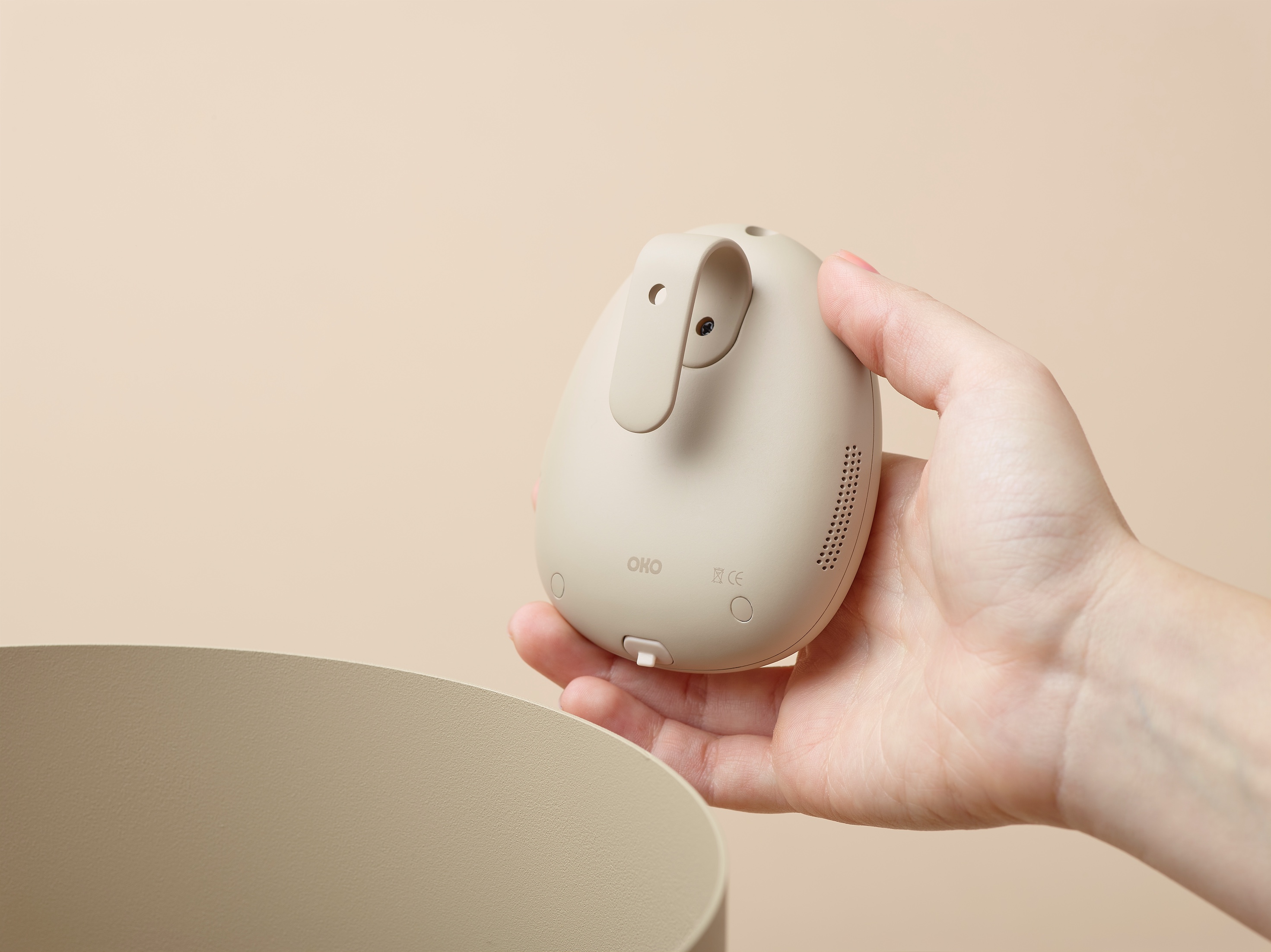
OKO is all about effortless plant care, and their website needed to be just as intuitive. We built a Shopify store that is calming, clean, and completely on-brand, making it easy for customers to shop, learn, and engage with the OKO experience. The UI reflects the same organic, expert aesthetic as the brand—no distractions, just a smooth, seamless digital space that feels as natural as the plants it’s designed to support.

Packaging

A box as thoughtful as the product

OKO’s sensor is sleek, smart, and seamlessly blends into any interior. The packaging needed to reflect that same philosophy—elegant, understated, and designed to disappear into the background while keeping the product safe. We created a minimalist yet functional box design, with clean lines and a premium feel that aligns with OKO’s brand ethos. No clutter, no unnecessary frills—just a calm, considered unboxing experience that mirrors the product inside.

The details

Custom icons

A brand as considered as OKO needed icons that felt just as intentional. We designed a custom, hand-drawn icon set to match the fluid, organic lines of the logo. Just like the wordmark, nothing is perfectly symmetrical—each icon feels grown, not built. These icons are used across the website, packaging, and marketing materials, adding a subtle but powerful layer of visual harmony to the brand.

luxury lighting
Next project

CTO Lighting

Explore Project
Luxury lighting